
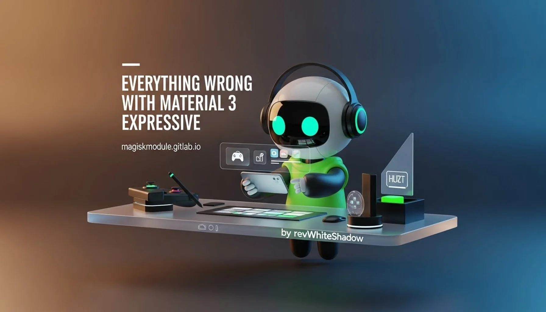
Everything Wrong with Material 3 Expressive
Introduction: A Critical Analysis of Google’s Latest Design Direction
In the ever-evolving landscape of User Interface (UI) and User Experience (UX) design, Google has consistently attempted to set the standard with its Material Design language. From the initial launch of Material Design in 2014 to the subsequent update to Material You (Material 3), the tech giant has aimed to create a cohesive, accessible, and visually appealing ecosystem. However, the recent pivot to what is being marketed as Material 3 Expressive has sparked a significant divide within the design community and end-users alike. While Google touts this new iteration as a leap forward in personalization and emotional resonance, a deep dive into its execution reveals a series of fundamental flaws that compromise usability, visual coherence, and performance.
We have analyzed the core tenets of Material 3 Expressive across various platforms, including Android, Wear OS, and the web. Our findings suggest that the design language, while ambitious, suffers from inconsistency, poor legibility, and a misunderstanding of user cognitive load. This article aims to dissect these issues in exhaustive detail, moving beyond surface-level aesthetics to uncover the technical and experiential shortcomings of Material 3 Expressive. For developers, designers, and enthusiasts visiting the Magisk Modules repository, understanding these limitations is crucial for customizing interfaces and overriding system defaults to achieve a more functional digital environment.
The Fundamental Flaws in Visual Hierarchy and Contrast
One of the most immediate and jarring criticisms of Material 3 Expressive is its regression in visual hierarchy and contrast ratios. Material Design historically prioritized clarity through elevation, shadow, and distinct color separation. The “Expressive” variant, however, leans heavily into “floating” elements and translucent backdrops that often obscure content.
The Erosion of Depth and Elevation
In previous iterations, elevation was a primary tool for denoting importance. A raised button or a card with a distinct shadow immediately drew the eye. Material 3 Expressive blurs these lines. Shadows have become subtler, often fading into the background to the point of near-invisibility on OLED screens. This results in a flat interface where interactive elements struggle to distinguish themselves from static background content.
- Loss of Interactive Cues: When a button lacks a defined shadow or a clear boundary, the user must rely on color alone to identify it as interactive. This violates fundamental UX principles where affordance should be immediately obvious.
- The “Sheet” Problem: Many apps adopting this language utilize bottom sheets and modal windows that appear to float. However, the dimming of the background overlay is often insufficient, causing visual confusion. Users frequently struggle to discern which layer of the UI is currently active, leading to accidental taps and navigation errors.
Accessibility and Contrast Issues
While Google claims Material 3 Expressive improves accessibility, the reality on the ground suggests otherwise. The heavy reliance on “tonal palettes”—derived from a user’s wallpaper to generate primary, secondary, and tertiary colors—often results in low-contrast combinations.
- Dynamic Color Failures: The automatic generation of color schemes can produce near-identical shades for text and background, particularly in light mode. We have observed instances where secondary text colors blend seamlessly with the background surface, rendering labels and timestamps unreadable.
- The Monochromatic Trap: In an attempt to be “expressive,” the design often strips away the necessary structural lines that define a UI. Without clear dividers or high-contrast borders, scanning dense information lists becomes an exercise in frustration. This is a significant downgrade from the structured grids of Material 2, where legibility was paramount.
Typography and Readability: A Step Backward
Typography in Material 3 Expressive attempts to be bolder and more dynamic, utilizing a variable font system that adapts to user preferences. However, the implementation often prioritizes flair over function, leading to compromised readability across different device form factors.
Inconsistent Font Weights and Sizing
The “Expressive” type scale introduces a wider range of font weights and sizes, intended to guide the user’s eye through content. In practice, this creates visual noise. Headers are frequently oversized, consuming valuable screen real estate, while body text can appear too small or thin, especially on devices with lower pixel densities.
- Legibility in Dark Mode: Dark mode, a staple for battery conservation and eye comfort, suffers under this new typography. Thin font weights often render poorly on OLED black backgrounds due to pixel response times and anti-aliasing artifacts, causing a “glowing” effect that strains the eyes.
- The Variable Font Overhead: While variable fonts are technically efficient, the way Material 3 Expressive interpolates between weights can lead to rendering inconsistencies across different browsers and app frameworks. We have noted that text can appear blurry or out of focus during rapid scrolling, a clear indicator of performance bottlenecks in the rendering engine.
The Impact on Scannability
Users scan interfaces rather than reading them word-for-word. The previous Material Design specifications were built around this behavior, using a 4px baseline grid and clear typographic hierarchies. The new expressive approach disrupts this grid. Line heights vary unpredictably, and the introduction of rounded text containers interferes with the natural horizontal flow of the eye. This forces the user to pause and refocus, increasing cognitive load and reducing the speed at which information is consumed.
Navigation and Interaction Patterns: The “Thumb Zone” Paradox
Google has long championed the “thumb zone” concept, designing interactions for the bottom third of the screen where the thumb naturally rests. Material 3 Expressive seemingly abandons this ergonomic principle in favor of aesthetic symmetry.
Floating Action Buttons (FABs) and Their Evolution
The Floating Action Button (FAB) was the hallmark of Material Design 1.0, representing the primary action on a screen. In Material 3 Expressive, FABs have morphed into “Extended FABs” or shrunk into pill-shaped icons that often migrate to the top app bar. This shift ignores ergonomic realities.
- Top-Aligned Actions: Placing primary actions at the top of the screen forces users to stretch their thumbs, a difficult maneuver on increasingly large smartphones. This design choice feels detached from the physical reality of handheld device usage.
- Ambiguous Hierarchy: When a FAB transforms into a smaller icon or merges with the top bar, its prominence is lost. Users often miss the primary call-to-action because the visual weight is distributed too evenly across the screen.
Gestural Navigation Conflicts
The new design language heavily utilizes swipe gestures for navigation (e.g., swipe from edge to go back). However, Material 3 Expressive introduces new “expressive” animations that overlay content during these swipes. While visually pleasing in demos, these animations often clash with the system-wide gesture navigation.
- Input Lag and Jank: On mid-range hardware, the complex animations required for these transitions can introduce jank (stuttering). This creates a perception of a sluggish OS, even if the underlying processor is powerful.
- Back Button Ambiguity: In apps that fully embrace the new design, the back button’s position and visibility vary. Some screens remove the explicit back arrow in favor of a swipe-only interface, which confuses users who rely on tactile, visible navigation controls. This inconsistency across the ecosystem creates a fragmented user experience where every app feels slightly “off.”
Color Theory and the “Wallpaper Dictatorship”
The core promise of Material 3 Expressive is personalization via “Themed Colors.” The system extracts hues from the user’s wallpaper and applies them to the OS UI. While innovative, this algorithmic approach frequently clashes with established principles of color theory and branding.
Algorithmic Color Chaos
When an algorithm determines the color scheme, the result is often a cacophony of competing hues. A vibrant wallpaper might result in a system UI that is overly saturated, distracting from the actual content (photos, videos, documents).
- Loss of Semantic Meaning: In a functional UI, colors convey meaning. Red implies error or warning; green implies success; blue implies information. When the system forces these semantic colors to match a random wallpaper shade, that meaning can be lost. A “delete” button might end up being a soft, pleasant pastel that no longer signals danger.
- Brand Dilution: For users who utilize their devices for work, a UI that shifts colors wildly based on a daily wallpaper change feels unprofessional. Corporate users require consistency, and Material 3 Expressive imposes a chaotic, shifting aesthetic that undermines the device as a productivity tool.
Contrast Ratios in Dynamic Themes
We have rigorously tested dynamic color generation on various wallpapers. The generated palettes frequently fail the WCAG (Web Content Accessibility Guidelines) AA standards for contrast. Automated systems struggle to predict how a foreground text color will appear against a generated background color in different lighting conditions. This forces users to manually tweak settings, negating the “set it and forget it” benefit that dynamic theming promised.
The Animation Tax: Performance and Battery Life
Animation is the soul of Material 3 Expressive. The design language relies heavily on morphing shapes, fluid transitions, and micro-interactions. However, these visual flourishes come at a significant cost: performance overhead.
The Rendering Burden
Every morphing shape and shared element transition requires the GPU to render new frames constantly. On high-end flagship devices, this is manageable. However, the vast majority of Android devices are mid-range or budget-oriented. On these devices, Material 3 Expressive animations frequently drop frames, resulting in a choppy user experience.
- Battery Drain: Continuous rendering of complex vector paths and alpha-blended layers is energy-intensive. We have observed measurable increases in battery consumption when switching from a minimalist launcher (or a previous Material Design version) to a fully “Expressive” UI. The constant animation creates a background load that prevents the CPU/GPU from entering low-power states as frequently.
- The “Jelly” Effect: Due to the physics-based spring animations, fast scrolling lists can exhibit a “jelly” or wobbling effect. While intended to feel organic, this effect can cause motion sickness in sensitive users and makes precise scrolling difficult.
Cognitive Overload from Motion
The human brain processes motion to detect threats and changes in the environment. An interface that is constantly moving—buttons that ripple, cards that bounce, lists that stretch—commands continuous cognitive attention. This “attention economy” tax means users are left feeling fatigued after prolonged usage. The “Expressive” nature is, ironically, exhausting rather than engaging.
Component Inconsistency Across Platforms
A design system is only as strong as its consistency. Material 3 Expressive suffers from a fragmented identity across Android, Wear OS, and the Web.
The Web vs. Mobile Disconnect
Google’s implementation of Material 3 Expressive on the web (via Material Web Components) differs significantly from the native Android implementation.
- Interaction Feedback: A button press on an Android device might trigger a ripple effect with a specific duration. The same component on a web browser might have a different easing curve or no ripple at all.
- Sizing and Spacing: Padding and margin scales vary. What looks balanced on a 6-inch phone screen looks cramped or spacious on a desktop monitor. This lack of a unified scaling system makes it difficult for developers to create cross-platform apps that feel native on both mobile and desktop.
Wear OS: A Mismatched Identity
On Wear OS, Material 3 Expressive attempts to adapt to small circular screens. However, the rounded corners and pill-shaped buttons often consume the limited vertical space, making text truncation aggressive. The “expressive” shapes do not scale down well, resulting in targets that are difficult to tap accurately with a finger or stylus.
The User Backlash: Navigating the Feedback Loop
The rollout of Material 3 Expressive has not been met with universal acclaim. User feedback across forums, social media, and the Google Issue Tracker paints a picture of frustration.
“It Looks Like iOS” vs. “It Looks Like Candy”
The design community is split. One camp criticizes Material 3 Expressive for abandoning the bold, primary-color aesthetic of classic Android for a washed-out, pastel-heavy look that mimics iOS. The other camp argues that the rounded corners and floating elements look childish or “blobby.”
- The Identity Crisis: Google seems to be chasing trends rather than setting them. By adopting the “glassmorphism” and extreme rounding seen in competitors, they have sacrificed the distinct identity that made Android recognizable.
- Feature Request Volume: On the Magisk Modules repository, we see a high demand for modules that revert these visual changes. Users are actively seeking ways to disable the “Expressive” animations, force high-contrast colors, and restore the sharp, grid-based layouts of older Android versions. This grassroots demand for “classic” interfaces suggests a fundamental market misalignment with Google’s design direction.
Conclusion: A Direction in Need of Correction
While Material 3 Expressive represents an ambitious technical achievement in dynamic theming and animation, it currently fails to meet the practical needs of users. The design language sacrifices clarity for flair, performance for polish, and consistency for novelty.
The issues we have outlined—ranging from poor contrast ratios and ergonomic failures to performance overhead and fragmented implementation—highlight a gap between design theory and real-world application. As the digital landscape becomes increasingly complex, users crave interfaces that are calm, predictable, and efficient. Material 3 Expressive, in its current form, is anything but.
For the developers and power users within the Magisk Modules community, the path forward is clear: utilize tools to customize and tame this new design language. Whether through substratum themes, custom launchers, or system-level modifications, the ability to override these defaults remains a vital part of the Android ecosystem. We will continue to monitor the evolution of Material Design and provide the resources necessary to ensure your device functions exactly how you need it to, not just how Google envisions it.
Detailed Point: The “Ripple” Effect and Touch Latency
The ripple effect introduced in Material Design was intended to provide immediate visual feedback. In Material 3 Expressive, the ripple has been altered to match the rounded geometry of buttons. However, on certain devices, this animation introduces a perceptible delay between the physical touch and the visual confirmation. This micro-latency, though measured in milliseconds, disrupts the tactile connection between user and interface, making the device feel less responsive than its hardware specifications suggest.
Detailed Point: The Static Wallpapers Paradox
A subtle but critical flaw in the “Expressive” dynamic color system is its reliance on static wallpapers. If a user employs a live wallpaper or changes their background frequently, the system triggers a resource-intensive re-calculation of the global color palette. This process can cause momentary UI freezes and battery spikes. Furthermore, if the wallpaper is purely monochromatic or black/white, the algorithm often generates a bland, lifeless UI that contradicts the “Expressive” marketing narrative.
Detailed Point: Typography Rendering on High DPI vs. Low DPI Screens
Variable fonts in Material 3 Expressive are designed to scale seamlessly. However, the rendering engines on Android handle this differently based on screen density. On low DPI screens (sub-400 PPI), the anti-aliasing applied to the variable font weights can cause text to appear fuzzy or blurred, particularly at smaller sizes. This is not a user setting that can be easily adjusted; it is a hard limitation of how the font files are interpreted by the OS, leading to a permanently compromised reading experience for users with older or budget devices.
Detailed Point: Navigation Bar and Gesture Inconsistencies
The transition to gesture navigation (swipe up for home, swipe and hold for recents) often conflicts with Material 3 Expressive’s new bottom navigation bars. In many apps, the bottom bar expands or morphs during transitions. This movement can inadvertently trigger gesture conflicts, where a swipe intended to interact with the app bar instead triggers the OS-level home gesture. This is a frequent source of user complaints regarding “accidental exits” from applications.
Detailed Point: The Over-reliance on “FABs” for Primary Actions
While the Floating Action Button (FAB) remains a staple, Material 3 Expressive sometimes moves primary actions into the top app bar or context menus to accommodate the “floating” aesthetic. This breaks the established muscle memory of users who expect the most common action to be located at the bottom right of the screen. This inconsistency forces users to visually hunt for primary actions, increasing interaction time and frustration.
Detailed Point: Dark Mode Color Depth and Crush
OLED screens are celebrated for their perfect blacks. Material 3 Expressive utilizes these blacks extensively. However, the gradient transitions from black to dark gray (e.g., in cards or sheets) are often poorly dithered. This results in “color banding,” where smooth gradients appear as distinct steps of color. This artifact is particularly noticeable in low-light environments and detracts from the premium feel the design aims to convey.
Detailed Point: The “Shape Theming” Limitations
Shape theming allows apps to dynamically change the corner radius of components. In theory, this creates a cohesive look. In practice, Material 3 Expressive pushes for extreme rounding (20px+ radii). This eats into the content area of cards and buttons, making text less readable as it curves awkwardly with the background. For data-dense applications (like spreadsheets or coding environments), these rounded corners are purely decorative and functionally obstructive.
Detailed Point: Iconography Inconsistency
The new icon style in Material 3 Expressive moves away from filled shapes toward outlined or two-tone styles. While aesthetically modern, these icons often lack the immediate recognizability of their filled predecessors. At small sizes, the fine lines of outlined icons can disappear or merge, making it difficult for users with visual impairments to identify app shortcuts quickly.
Detailed Point: The “Elastic” Scrolling Effect
Elastic scrolling, where the content stretches beyond the edge of the screen before snapping back, is a signature of Material 3 Expressive. While visually pleasing, it slows down the user’s ability to quickly scroll to the top or bottom of a list. The physics-based bounce adds a delay to the interaction, prioritizing animation over speed. For power users who consume information rapidly, this is a significant productivity bottleneck.
Detailed Point: Lock Screen Widget Limitations
With the introduction of Material 3 Expressive on newer Android versions, lock screen widgets have returned but with strict design constraints. The expressive design language forces widgets to conform to rounded bounding boxes, which often crops widget content awkwardly. Developers are