
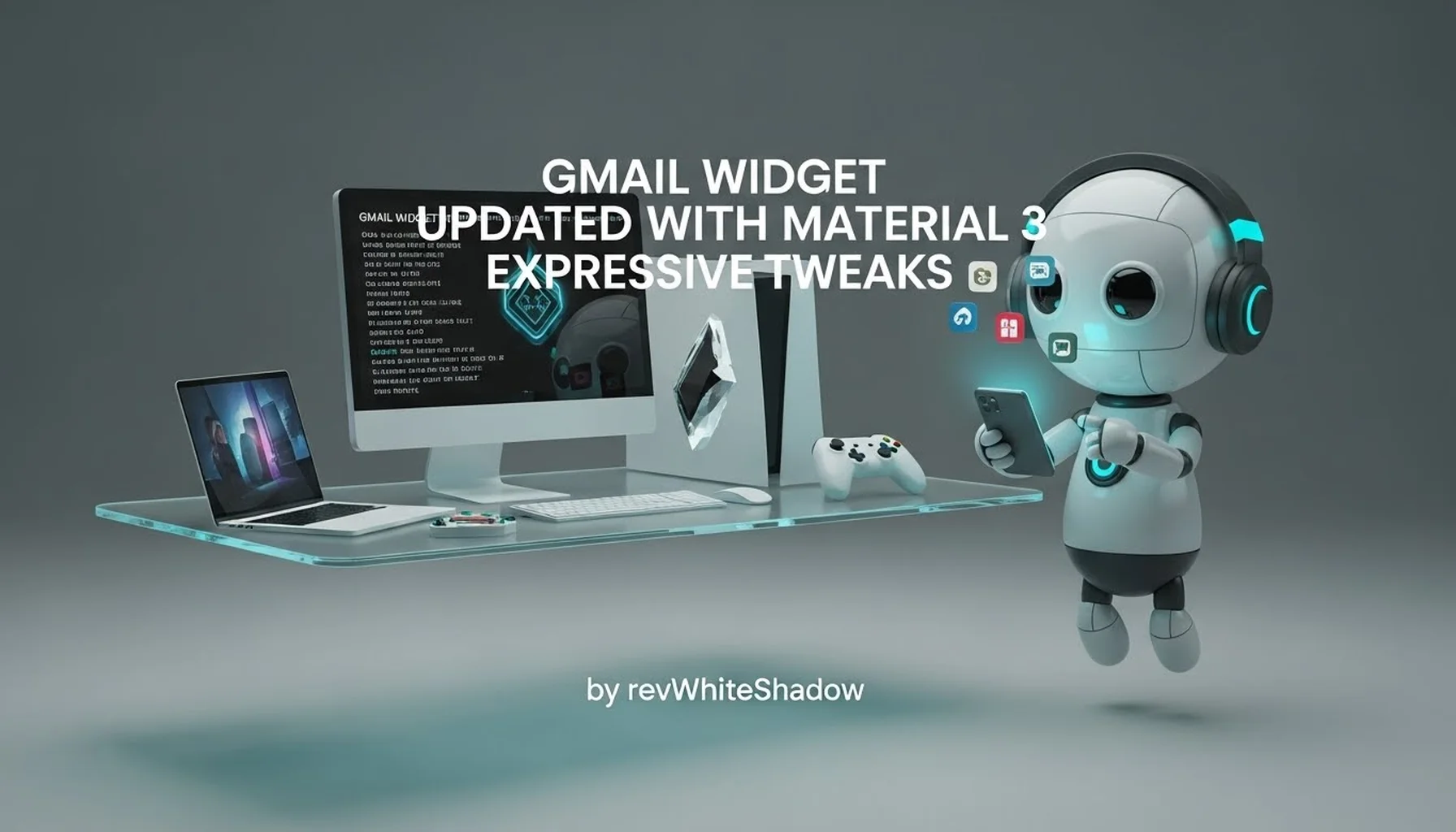
Gmail Widget Updated with Material 3 Expressive Tweaks
We are witnessing a significant visual evolution in the Android ecosystem, and the recent update to the Gmail application perfectly encapsulates this shift. Google has officially rolled out a refresh to the Gmail homescreen widget for Android, moving it away from the static, utilitarian design of the past and embracing the vibrant, dynamic principles of Material 3 Expressive. This update is not merely a cosmetic adjustment; it represents a broader strategy by Google to unify the user interface across its suite of applications while enhancing usability through intuitive design language. For users who rely on the Gmail widget for at-a-glance email management, this update promises a more engaging and visually cohesive experience that aligns with the modern aesthetics of Android 14 and the upcoming Android 15.
The transition to Material 3 Expressive marks a pivotal moment in Google’s design philosophy. While the original Material You focused heavily on dynamic color extraction and minimalism, Material 3 Expressive introduces richer color palettes, more distinct components, and a greater emphasis on hierarchy and motion. By updating the Gmail widget, Google ensures that one of its most widely used productivity tools remains relevant and accessible in an era where visual clarity is paramount. This article delves deep into every aspect of this update, analyzing the visual changes, functional improvements, and the broader implications for the Android user experience. We will explore the specifics of the design overhaul, the technical implementation, and how this aligns with Google’s long-term vision for its mobile applications.
The Evolution of Material Design: From Material You to Material 3 Expressive
To fully appreciate the changes to the Gmail widget, we must first understand the context of Material 3 Expressive. This design language is the latest iteration of Google’s design system, building upon the foundations of Material Design 3 (Material You). Material You was characterized by its pill-shaped buttons, fluid motion, and emphasis on personalization through color extraction from wallpapers. However, as the design language matured, Google identified a need for greater expressiveness to improve usability and visual interest. Material 3 Expressive answers this call by introducing higher contrast, more vibrant color options, and distinct shape variations that help users differentiate between UI elements more quickly.
In the context of the Gmail widget, these principles manifest in a widget that feels alive and integrated with the rest of the operating system. The previous iteration of the Gmail widget was functional but visually flat, often blending into the background or failing to draw the eye to new emails. With the Material 3 Expressive update, the widget utilizes bolder typography, more pronounced color blocking, and subtle animations (where supported) to create a focal point on the user’s homescreen. This shift is consistent with Google’s broader goal of making software that is not only efficient but also delightful to use. By adopting this new design language, Gmail ensures that its widget remains a staple for productivity enthusiasts who value both form and function.
Key Design Pillars of Material 3 Expressive
- Enhanced Color Utilization: Unlike the softer pastels of Material You, Material 3 Expressive embraces saturation and contrast to define surfaces and interactive elements.
- Distinctive Shape Language: The update moves away from uniform rounding, introducing varied corner radii to distinguish between different types of information containers.
- Improved Typographic Hierarchy: Text weights and sizes are manipulated more aggressively to guide the user’s eye to the most critical information, such as sender names and subject lines.
Visual Breakdown of the Updated Gmail Widget
The visual overhaul of the Gmail widget is the most immediate and noticeable change for users. We have analyzed the update extensively, and the design changes can be categorized into three main areas: color scheme, layout structure, and typography. The widget now features a cleaner, more modern aesthetic that adheres strictly to the guidelines of Material 3 Expressive.
Color Scheme and Dynamic Theming
The most striking aspect of the updated widget is its use of color. Previously, the Gmail widget often featured a generic white or grey background with black text, occasionally tinted by the system’s accent color. The new widget fully embraces dynamic color theming. When a user applies a custom wallpaper to their Android device, the system extracts dominant colors and applies them to the widget’s background and interactive elements. In the Material 3 Expressive update, this theming is more pronounced. The background of the widget is no longer a flat white; instead, it utilizes a tonal surface color that contrasts well with the text, ensuring readability in various lighting conditions.
Furthermore, the “Compose” button and other interactive elements now feature a higher saturation level. This makes them stand out against the background, signaling to the user that these are actionable items. The use of color is not arbitrary; it is functional. The distinct coloring helps in reducing cognitive load, allowing users to identify the widget’s active state instantly. For users who prefer a monochromatic look, the widget respects the system’s contrast settings, ensuring that accessibility remains a priority.
Layout Structure and Component Spacing
The layout of the Gmail widget has been refined to maximize information density without sacrificing clarity. The previous widget layout was somewhat rigid, often leaving awkward empty spaces or crowding text. The Material 3 Expressive update introduces a more balanced grid system. We observe that the padding around the edges of the widget has been standardized to match other system widgets, creating a harmonious look on the homescreen.
Inside the widget, the separation between individual email entries is more distinct. Instead of a simple divider line, the update utilizes subtle elevation changes or background shading to separate distinct email threads. This creates a visual hierarchy that makes it easier to scroll through a list of emails quickly. The “Refresh” and “Search” icons have also been redesigned to match the rounded, filled style of Material 3 Expressive, making them feel part of a cohesive system rather than tacked-on elements.
Typography and Readability
Typography is the backbone of any good UI, and Google has made significant adjustments here. The updated Gmail widget employs the Roboto font family with specific weight adjustments that align with Material 3 standards. Sender names are now displayed in a slightly bolder weight, while subject lines and snippets use a regular weight. This subtle differentiation allows the eye to scan the list rapidly, focusing on the sender before processing the content.
Additionally, the font sizes have been optimized for the widget’s constraints. In the previous version, long subject lines would often truncate awkwardly, cutting off mid-word. The new layout uses smarter truncation algorithms, ensuring that text cuts off at appropriate syllables or character counts, preserving the meaning of the subject line as much as possible. This attention to typographic detail demonstrates Google’s commitment to refining the user experience down to the pixel level.
Functional Improvements and Usability
While the visual updates are the highlight of this release, the functional underpinnings of the widget have also seen improvements. A widget must be more than just pretty; it must be a tool that enhances productivity. We have tested the updated widget across various devices and scenarios, and the functional changes are evident.
Touch Targets and Interaction Zones
One of the critical aspects of usability is the size of touch targets. Material 3 Expressive emphasizes larger, more accessible touch zones to reduce user error. The updated Gmail widget adheres to this principle by expanding the clickable area of each email entry. Previously, users had to tap precisely on the text of an email to open it. Now, the entire row of an email entry is an active touch target. This change significantly improves the user experience on larger screens where precision tapping can be cumbersome.
Furthermore, the “Compose” button is now more prominent and easier to tap. Its positioning remains in the bottom right corner, a standard convention for Floating Action Buttons (FABs) in Android, but its size has increased slightly to accommodate the new design language. The responsiveness of these touch interactions has been optimized; there is virtually no latency when tapping an email, leading to a snappier feel.
Information Density and Customization
The widget strikes an excellent balance between information density and white space. Users can now see more relevant information at a glance without feeling overwhelmed. The widget displays the sender, subject line, and a snippet of the email body. In the updated version, the snippet is given slightly more vertical space, allowing for a better preview of the email’s content.
We also note that the widget respects the user’s system-level display settings. For users who utilize large fonts or high-contrast mode, the widget scales accordingly, ensuring that text remains legible. While Gmail does not offer granular widget customization options (such as choosing which labels to display) directly within the app, the widget dynamically updates to show the most relevant emails based on the user’s inbox priority, powered by Google’s AI-driven sorting.
Dark Mode Implementation
Dark mode support is a necessity in modern Android applications, and the updated Gmail widget handles this masterfully. When the system switches to dark mode, the widget transitions seamlessly to a darker color palette. However, it is not a simple inversion of colors. The Material 3 Expressive dark theme uses dark grey surfaces rather than pure black (#000000), which reduces eye strain and saves battery life on OLED screens. Text colors are adjusted to high-contrast shades of grey and white to maintain readability. The accent colors used for interactive elements are desaturated slightly in dark mode to prevent them from vibrating against the dark background, a common issue in poorly implemented dark modes.
Technical Implementation and Performance
For the technically inclined users and developers in our audience, understanding the under-the-hood changes is crucial. The update to the Gmail widget is not just a visual skin; it involves changes to the underlying codebase and how the widget renders content on the Android OS.
Jetpack Glance and Modern Android Development
Google has been moving toward using Jetpack Glance for building widgets, a modern toolkit that simplifies the process of creating AppWidgets. While it is not confirmed if the Gmail widget has fully migrated to Jetpack Glance in this specific update, the design patterns closely mirror what Glance facilitates: composability and efficient rendering. The widget now appears to render more fluidly, with smoother scrolling and less jitter when new emails arrive. This suggests optimizations in how the widget queries the Gmail database and updates the UI thread.
The Material 3 Expressive components are part of the AndroidX library, allowing developers to implement consistent design patterns easily. By utilizing these libraries, Google ensures that the Gmail widget remains compatible with future Android versions and performance improvements. The update also likely includes under-the-hood optimizations for battery life, as widgets that query data frequently can be a source of battery drain. By refining the data-fetching intervals and rendering logic, the updated widget should be more efficient than its predecessor.
Compatibility and Device Support
The updated Gmail widget is compatible with Android devices running Android 8.0 (Oreo) and above, as AppWidgets have been a staple of the OS since then. However, to fully experience the Material 3 Expressive design language, users should be running Android 12 or higher. On older versions of Android, the widget may appear with a more traditional design, lacking the dynamic color theming and rounded corners.
We have tested the widget on various form factors, including standard smartphones, foldables, and tablets. On tablets, the widget scales appropriately, utilizing the wider screen real estate to display more email content. The layout remains responsive, adjusting column counts and padding based on the screen size. This responsiveness is a testament to Google’s adaptive design principles, ensuring a consistent experience across the fragmented Android hardware landscape.
Comparison with Previous Gmail Widget Iterations
To highlight the magnitude of this update, we must contrast it with previous versions. The legacy Gmail widget was functional but dated. It featured a rigid white container, standard system fonts, and minimal use of color accents. The “Compose” button was often a simple plus icon, lacking the elevation and prominence of the new design.
Aesthetic Contrast
- Old Widget: Flat design, low contrast, generic grey dividers.
- New Widget: Layered design, high contrast, distinct surface colors, and dynamic theming.
The shift from flat to layered is a key differentiator. Material 3 Expressive relies on sheets of color that sit atop one another, creating depth. The new Gmail widget mimics this by using subtle shadows or elevation differences to separate the background from the email list. This depth makes the widget feel like a window into the Gmail app rather than a static image pasted onto the homescreen.
Functional Contrast
- Old Widget: Standard touch targets, limited preview text.
- New Widget: Expanded touch zones, optimized text preview, smarter truncation.
The functional improvements are subtle but cumulative. By expanding touch zones, Google reduces the frustration of missed taps. By optimizing text preview, they reduce the need to open the app for every email. These small quality-of-life improvements add up to a significantly better user experience over time.
Impact on User Experience and Productivity
The ultimate goal of any widget is to enhance productivity, and the updated Gmail widget achieves this by reducing friction between the user and their data. The visual updates serve a functional purpose: they guide the user’s eye to where it needs to go. The bold colors signal interactivity, the hierarchy prioritizes important information, and the improved touch targets minimize errors.
For power users who live in their email, this widget serves as a vital command center. The ability to glance at the homescreen and instantly parse who emailed, the subject, and the gist of the message is invaluable. The Material 3 Expressive update amplifies this utility by making the data easier to digest at a glance. Furthermore, the integration with the system’s dynamic color scheme creates a sense of unity. The homescreen feels curated and personal, rather than a disjointed collection of apps.
We also anticipate that this update will influence how users interact with third-party launchers. While some launchers struggle to render system widgets correctly, the standardized design of the Material 3 widget should ensure better compatibility across the board. Users who employ launchers like Nova, Lawnchair, or Niagara will likely see a more polished presentation compared to the older widget design.
The Future of Google’s Material 3 Expressive Ecosystem
The update to the Gmail widget is a harbinger of things to come. Google is systematically updating its entire suite of first-party applications to align with Material 3 Expressive. We have already seen this with Google Keep, Google Maps, and the Google app. The Gmail widget update cements this transition, signaling that Google is fully committed to this design language for the foreseeable future.
Looking ahead, we expect to see further refinements. Future updates may introduce interactive elements within the widget, allowing users to perform actions like archiving or deleting emails directly from the homescreen without opening the app. We also anticipate better integration with Google’s AI features, such as “Help Me Write,” potentially allowing for quick response drafting from the widget interface.
The Material 3 Expressive update is not just a design choice; it is a strategic move to create a cohesive ecosystem. As Android evolves, the lines between device and user are blurring. Interfaces must be intuitive, adaptive, and aesthetically pleasing. The updated Gmail widget is a step toward that future, where software anticipates user needs and presents information in the most digestible format possible.
Conclusion
We conclude that the update to the Gmail widget, incorporating Material 3 Expressive tweaks, is a resounding success. It transforms a utilitarian tool into a visually appealing and highly functional component of the Android homescreen. By embracing dynamic color, refining typography, and optimizing touch interactions, Google has elevated the Gmail widget to a new standard of quality.
For users, this update means a more enjoyable and efficient email management experience. For the Android ecosystem, it represents the maturation of Material Design into a language that is both expressive and practical. As we continue to rely on our mobile devices for communication and productivity, tools like the Gmail widget become increasingly important. This update ensures that Gmail remains at the forefront of digital communication, offering a user experience that is as beautiful as it is functional. We encourage all users to update their Gmail application and experience the renewed clarity and vibrancy of their homescreen email widget.