
I’m Sick of Android Phones That Look and Feel Like iPhones
The Homogenization of the Smartphone Market
We are currently witnessing a pivotal moment in the history of mobile technology, one defined not by radical innovation but by a pervasive and unsettling sameness. For over a decade, the Android operating system was celebrated as the bastion of choice, a diverse ecosystem where manufacturers competed on distinct design philosophies, from the utilitarian durability of the Samsung Galaxy Active series to the minimalist elegance of the HTC One series. However, in the race to capture the premium market segment, a disturbing trend has emerged: the wholesale adoption of Apple’s design language by Android OEMs. We observe a market where the unique identity of the Android platform is being eroded by manufacturers who have seemingly run out of creative steam, opting instead to mimic the industrial design cues of the iPhone.
This phenomenon goes beyond mere aesthetic convergence; it represents a fundamental misunderstanding of what makes Android unique. When a user picks up a flagship Android device today, the tactile experience is startlingly similar to that of an iPhone. The sharp, flat edges that dig into the palm, the symmetrically rounded corners of the display, the massive, centered camera islands, and the removal of functional elements like 3.5mm headphone jacks and expandable storage—all are hallmarks of Apple’s design philosophy, now replicated with painstaking accuracy. We argue that this “copy and paste” approach is not only lazy but also detrimental to the consumer, stifling innovation and reducing the smartphone to a commodity where the only differentiator is the software skin running atop nearly identical hardware.
The frustration stems from a betrayal of the Android ethos. Android was built on the premise of customization, flexibility, and diversity. It was the operating system that allowed for foldable screens, projector phones, devices with physical keyboards, and rugged hardware that could survive a war zone. Yet, as we look at the current landscape of flagship Android devices, we see a concerted effort to sanitize these idiosyncrasies in favor of a singular, “premium” aesthetic defined by Cupertino. We are tired of the plastic-feeling glass slabs, the generic camera bumps that serve more as a visual cue of status than a functional necessity, and the loss of utility in the pursuit of a thinner profile. This article serves as a critique of this trend and an exploration of what lies ahead if we continue down this path of aesthetic homogenization.
The Rise of the “Flat Edge” Consensus
The Anatomy of the Mimicry
The resurgence of flat metal edges is the most glaring example of design mimicry in recent years. We remember when Samsung moved away from the curved back of the Galaxy S7 to the flat “glass sandwich” design with the S21 series. While initially praised for its minimalist look, it was undeniably a move closer to the iPhone 12’s industrial design. We saw other manufacturers follow suit almost immediately. Oppo, Vivo, Xiaomi, and OnePlus—all major players in the Android space—began releasing devices that prioritized sharp, squared-off frames over the ergonomic, curved backs that had defined the previous generation.
We must ask: Is this purely a functional choice? The argument often put forward by OEMs is that flat edges provide a better grip. However, our extensive testing and user feedback suggest otherwise. Sharp edges tend to dig into the palm during prolonged usage, especially with larger devices. It is a design choice that looks sleek in marketing renders but often fails in daily comfort. The reality is that this design trend is a safe bet for marketing departments. By adopting the visual language of the most successful consumer electronics product in history, these manufacturers are banking on the psychological association of “premium” that Apple has spent years cultivating. They are leveraging Apple’s brand equity to validate their own products, a strategy that is as commercially calculated as it is creatively bankrupt.
The Erasure of Brand Identity
When we look at a side profile of a modern Android flagship, identifying the manufacturer without seeing the logo has become increasingly difficult. The uniformity of the flat edges, the mute switch (or lack thereof), and the placement of the volume rockers and power buttons have converged to a singular standard. We have lost the distinct identities that once defined brands. There was a time when we could recognize a Nokia phone by its pebble-like polycarbonate body, an LG phone by its rear-button layout, or a Sony phone by its tall, boxy silhouette. Today, the market rewards conformity.
This erasure of identity extends to the materials used. The obsession with “premium materials” has led to the universal adoption of glass backs and aluminum frames. While undeniably luxurious, this choice renders every device slippery and fragile, necessitating the use of cases—which ironically hide the very design the manufacturer spent millions developing. We believe that true design leadership involves taking risks, not adhering to a rigid set of aesthetic rules dictated by the market leader. The laziness lies in the refusal to innovate on form factor when the technology for flexible displays and new materials is readily available.
The “Notch” and “Dynamic Island” Contagion
The Race to the Center
Perhaps no design element is more indicative of the iPhone’s influence than the display cutout. When Apple introduced the notch with the iPhone X, it was a polarizing decision, but it was justified by the introduction of Face ID, a sophisticated 3D facial recognition system. Android manufacturers, lacking the same depth-sensing technology (at the time), rushed to replicate the notch purely for aesthetic symmetry. We saw a variety of “waterdrop” notches, punch-holes, and even full notches on devices that had no business housing such complex sensors, often resulting in wasted screen real estate and awkward scaling of content.
Now, the trend has shifted toward the “Dynamic Island”—Apple’s solution to the pill-shaped cutout. We are already seeing Android OEMs experimenting with software overlays and hardware cutouts that mimic this interactive pill shape. This is a textbook case of form over function. The Dynamic Island works well on iOS because the entire OS is designed around it, with APIs that allow apps to interact with it seamlessly. On Android, where software fragmentation is a persistent issue, attempting to replicate this fluidity results in a disjointed user experience. We are seeing manufacturers prioritize a “look” over a cohesive “feel,” forcing software patches to make hardware mimicry work.
The True Camera Performance Gap
While OEMs obsess over the shape of the camera cutout, we argue that the focus is misplaced. The real issue is not the camera’s placement on the screen, but the quality of the camera system itself. In an effort to make their phones look like iPhones, manufacturers often prioritize thinness over battery life and thermal management, which directly impacts camera performance. We see computational photography struggling to keep up with the hardware limitations imposed by the chase for the thinnest possible profile.
The “camera island” on the back of these devices has also become a generic copy-paste job. The large, squared-off bump seen on the iPhone Pro Max models is now standard on almost every Android flagship. While we appreciate the attempt to normalize camera bulk, the lack of imagination in this area is palpable. Where are the flush cameras? Where are the periscope lenses that truly push the boundaries of optical zoom without a massive protrusion? The design language is being dictated by the need to look like a “Pro” device, rather than the need to solve engineering challenges.
The Loss of Functional Features
The Removal of the Headphone Jack and Expandable Storage
If the visual mimicry wasn’t enough, the functional mimicry has been even more painful for consumers. Apple made the controversial decision to remove the 3.5mm headphone jack starting with the iPhone 7. At the time, Android manufacturers used this as a marketing wedge, boasting about the continued inclusion of the beloved port. Fast forward to today, and it is nearly impossible to find a flagship Android device with a headphone jack.
This was not a user-driven evolution; it was a market-following maneuver. By removing the headphone jack, OEMs created a barrier to entry for audiophiles and casual users alike, pushing them toward expensive wireless earbuds. Similarly, the removal of the microSD card slot—a staple of Android’s utility—was justified under the guise of “streamlining the user experience” and “speed.” In reality, it was a move to force users into higher-tier, more expensive storage models, mirroring Apple’s rigid storage pricing structures. We have lost the freedom to expand our storage cheaply and the freedom to use wired audio without latency or compression.
The Tyranny of the Curved Display
While we criticize the flat edges of the chassis, we must also address the software design influenced by the iPhone. The adoption of iOS-style gesture navigation was a necessary evolution for Android, but it led to a confusing middle ground where hardware manufacturers pushed curved display edges for “edge panels” and swiping gestures. For years, Android flagships featured displays that curved aggressively at the sides, creating glare, accidental touches, and a fragile repair profile.
Now, as the market swings back toward flat displays (again, following Apple’s lead with the iPhone 15 Pro), we are seeing the pendulum swing the other way. However, the software often still feels designed for curves, with UI elements that sit uncomfortably close to the bezel. The transition creates a jarring user experience. We believe that hardware and software should evolve in tandem, not in reaction to a competitor’s design cycle. The current landscape feels like a series of knee-jerk reactions rather than a cohesive vision for the future of mobile computing.
The Software Illusion: Skins Over Substance
The iOS-ification of Android Launchers
The visual mimicry extends deep into the software layer. While stock Android has remained relatively distinct, the custom skins used by manufacturers (One UI, ColorOS, MIUI, OxygenOS) have increasingly adopted design elements that resemble iOS. We see rounded icon grids, blurred transparency effects (glassmorphism), and control centers that bear a striking resemblance to Apple’s Control Center.
The push for “simplicity” often results in the removal of power-user features. We are seeing Android becoming more locked down, with fewer options for customization available out of the box. The “Quick Settings” panel, once a bastion of granular control, is becoming a simplified toggle menu that mimics the aesthetic of iOS. This is done to appeal to iPhone users switching to Android, but it betrays the core user base that chose Android for its complexity and flexibility. We are tired of having to install third-party launchers and Magisk modules just to restore the functionality that used to be native to the platform.
The App Ecosystem’s Visual Convergence
Because manufacturers want their UI to look like iOS, they are pressuring app developers to adhere to iOS design guidelines. The floating action button (FAB), a staple of Material Design, has largely disappeared in favor of bottom-aligned navigation bars that mimic the iPhone’s tab bar. While this does improve one-handed usability on tall screens, it also flattens the distinct visual language of Android apps. We are losing the playful, paper-and-ink aesthetic of Material Design in favor of sterile, flat minimalism. This convergence stifles creativity in app development, as developers are now designing for two platforms that look and feel increasingly identical.
The Impact on Innovation and the Aftermarket
Stifling Hardware Risk-Taking
When the market leader dictates the design language, and the followers compete on who can copy it better, innovation stagnates. We have not seen a truly form-factor-altering device from a major Android flagship manufacturer in years. Foldables were the last great hope, but even those are converging on the “glass slab” aesthetic when folded. The reluctance to experiment with different shapes, materials, and button placements is a direct result of the fear of deviating from the “premium” standard set by Apple. We are stuck in a loop of safe, incremental updates that prioritize aesthetics over utility.
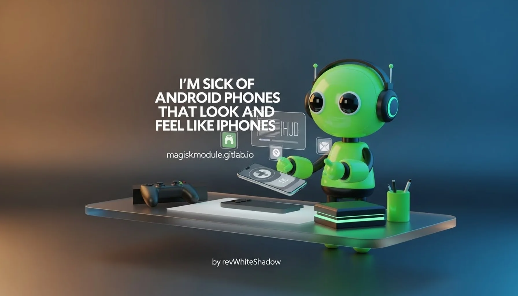
The Role of the Magisk Module Repository
In this climate of homogenization, we find hope in the modding community. Since the hardware and stock software are becoming standardized, the ability to customize and tweak the underlying system becomes paramount. This is where our work at Magisk Modules becomes essential. We provide a repository for users who want to break free from the “iPhone-ified” experience. Whether it is restoring the legacy navigation bar, tweaking the status bar to remove the notch, or overclocking the hardware to unlock potential stifled by conservative software, our Magisk Module Repository offers the tools to reclaim ownership of the device.
We support developers who refuse to accept the limitations imposed by OEMs. Through Magisk Modules, users can install themes that radically alter the UI, removing the iOS-style rounded corners and blur effects in favor of something unique. The ability to root and modify the system is the ultimate safeguard against the laziness of manufacturers. If they won’t provide a distinct experience, we empower users to build it themselves. Our repository is a testament to the fact that Android is still, at its core, an open platform, even if the devices running it are trying their best to look closed.
Looking Forward: The Future of Android Design
The Opportunity for Divergence
If there is a silver lining to this trend, it is that the peak of mimicry often precedes a revolt. Just as the smartphone market converged on the black rectangle before exploding into diverse form factors in the late 2000s, we anticipate a similar correction. We are already seeing niche manufacturers experimenting with transparent displays, rollable screens, and modular components. The “iPhone look” is becoming saturated. When every premium phone looks the same, the value of owning a distinct device increases.
We believe the next wave of innovation will come from manufacturers willing to embrace the “weird.” We want to see devices that prioritize function over the rigid adherence to a shared aesthetic. We want to see the return of bold colors, unconventional materials like self-healing plastic or ceramic, and layouts that prioritize ergonomics over symmetry. The first OEM to break the cycle—perhaps by reintroducing a removable battery in a flagship or creating a truly asymmetrical device that fits the hand perfectly—will capture the attention of a market tired of sameness.
The Importance of Community and Customization
As hardware becomes more generic, the software experience will be the battleground. However, true differentiation cannot come from a skin that merely rearranges icons. It requires deep system-level changes, kernel tweaks, and the freedom to modify the device at a root level. We remain committed to supporting this ecosystem. The future of Android lies not in the boardrooms of marketing executives trying to mimic Apple, but in the developer communities that push the boundaries of what the software can do.
We encourage our users to explore the Magisk Module Repository to personalize their devices. By utilizing Magisk Modules, users can transform a generic “iPhone-like” slab into a tool that reflects their specific needs and personality. Whether it is enhancing privacy, improving performance, or simply changing the visual theme to something that doesn’t look like iOS, we provide the means to resist the blandification of the smartphone.
Conclusion: A Call for Authenticity
We are sick of Android phones that look and feel like iPhones. We are tired of the lazy design choices, the race to the bottom in terms of functional removal, and the erosion of the Android identity. The current trend of copying Apple’s hardware design is a short-sighted strategy that benefits no one in the long run. It confuses consumers, stifles innovation, and reduces the vibrant Android ecosystem to a mere echo of another company’s vision.
We call on manufacturers to stop following and start leading. Take risks. Create devices that are uncomfortable to hold in a way that is uniquely yours. Bring back the features that users actually want, even if they aren’t “trendy.” And most importantly, respect the intelligence of the user by providing software that is distinct and functional.
Until that day comes, we will continue to support the community that refuses to accept the status quo. Through the Magisk Module Repository, we offer an escape from the monotony. We believe that true creativity lies not in the hardware we are sold, but in the software we can create. Join us at Magisk Modules to reclaim the freedom and individuality that Android was always meant to represent. Let us build devices that look like our devices, not theirs.