
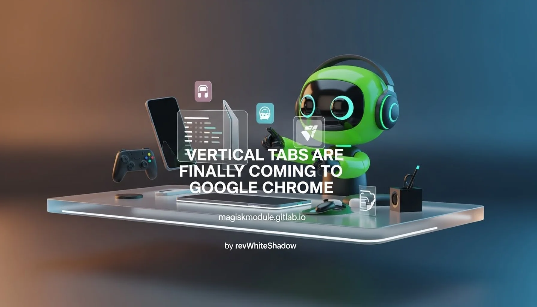
Vertical Tabs Are Finally Coming to Google Chrome
Introduction to the Chrome Vertical Tabs Revolution
We are witnessing a significant shift in the browsing experience as Google Chrome, the world’s most dominant web browser, prepares to introduce a long-awaited feature: native vertical tabs. For years, users have relied on third-party extensions or alternative browsers to manage tab overload, but the landscape is changing. This evolution marks a pivotal moment for productivity and user interface design within the Chrome ecosystem.
The announcement that vertical tabs are finally coming to Google Chrome is not merely a cosmetic update; it represents a fundamental rethinking of how we interact with multiple web pages simultaneously. As bandwidth and processing power increase, the limitation has often been the human ability to manage on-screen information. Chrome’s move to integrate this feature natively into the browser interface signals a commitment to addressing the core pain points of modern web browsing.
We understand that for power users, developers, and researchers, the horizontal tab strip has become a bottleneck. As the number of open tabs increases, favicons and titles become unreadable, forcing users to rely on memory rather than visual cues. By implementing vertical tabs, Google is directly tackling the issue of tab density and visibility. This change will allow for a more organized workspace, similar to the workflows found in code editors and project management tools.
For the community at Magisk Modules, where precision and customization are paramount, this development is particularly relevant. The ability to better organize browser tabs parallels the ethos of Magisk itself—taking control of the device and optimizing it for personal efficiency. Whether you are managing a complex development environment or simply browsing through extensive research materials, the introduction of vertical tabs will fundamentally alter your interaction with the web.
The Evolution of Tab Management in Web Browsers
To appreciate the significance of this update, we must first contextualize the history of tab management. The concept of tabs was popularized by browsers like Opera and later perfected by Firefox and Chrome. It replaced the clutter of multiple window instances with a single, consolidated interface. However, as web usage shifted from simple page viewing to complex, multi-session workflows, the limitations of the horizontal model became apparent.
The Horizontal Tab Bottleneck
The traditional horizontal tab strip operates on a fixed height, usually displaying only a handful of tabs at once before requiring scrolling or discarding. In a high-resolution environment, particularly on ultrawide monitors, this horizontal space is ample, but the vertical screen real estate is often underutilized. Conversely, on standard 16:9 laptops, the horizontal space is limited, causing tabs to shrink rapidly.
We have observed that the horizontal model forces a cognitive load on the user. When twenty tabs are open, the user must hover over each one to read the title or rely on a small favicon. This “tab blindness” leads to lost context and inefficiency. The browser essentially forces the user to remember what each tab contains rather than allowing the visual cortex to process the information instantly.
Pioneers in Vertical Tab Implementation
Before Chrome’s native integration, the concept was proven effective by other platforms. The Microsoft Edge browser was a notable pioneer, introducing a robust vertical tabs feature that allowed users to slide the tab strip onto the left or right side of the viewport. This provided a full view of the page title and allowed for easy scanning of dozens of open tabs.
Similarly, browsers like Vivaldi and Firefox (via extensions) have long catered to power users who preferred vertical layouts. These implementations demonstrated that vertical tabs are not just a novelty but a serious productivity tool. By observing the success of these alternatives, we can confirm that Google’s adoption of this feature is a response to market demand and competitive pressure.
The Psychology of Visual Organization
From a psychological perspective, vertical lists are inherently easier for the human brain to parse than horizontal strips. Our reading patterns, particularly in Western languages, follow a top-to-bottom trajectory. Vertical tabs align with this natural cognitive flow, allowing for faster scanning and identification of specific pages.
Furthermore, a vertical layout creates a clearer hierarchy. The browser window is divided into a narrow navigation column on the side and a wide content area in the center. This separation of concerns—navigation versus consumption—mirrors the design patterns of native desktop applications, making the browser feel less like a simple document viewer and more like a powerful operating system for the web.
How Native Vertical Tabs Function in Google Chrome
The implementation of vertical tabs in Chrome is designed to be seamless, intuitive, and unobtrusive. We have analyzed the current builds and feature flags to understand exactly how this functionality operates. The goal is to provide a toggleable interface that respects the user’s workflow without permanently altering the browser’s default behavior.
Activating and Configuring the Feature
Currently, the vertical tabs feature is accessible through Chrome Flags, an experimental configuration menu intended for testing upcoming features. By navigating to chrome://flags, users can search for “Vertical Tabs” and enable the experiment. Once activated and the browser is relaunched, the interface changes immediately.
The configuration options are straightforward:
- Toggle State: A simple button appears in the tab strip to switch between horizontal and vertical modes.
- Grouping Support: Native tab groups, a feature introduced previously, translate perfectly to the vertical layout. Collapsed groups appear as distinct blocks, while expanded groups list the individual tabs indented underneath.
- Floating Controls: In vertical mode, standard browser controls like the reload, back, and forward buttons are integrated into the header of the tab panel.
Interface Dynamics and Layout
When vertical tabs are engaged, the tab strip expands to occupy a dedicated sidebar. This sidebar typically takes up a percentage of the screen width, but users can drag the divider to resize it. Unlike the horizontal strip, which competes for vertical pixel height with the web page content, the vertical sidebar runs parallel to the content.
We note that the vertical tab panel is highly customizable. Users can pin tabs to the top, which remain visible regardless of scroll position. Pinned tabs usually display only their favicons to save space, but hovering over them reveals the full title. This is ideal for keeping essential services like Gmail, Slack, or the Magisk Module Repository constantly accessible.
Integration with Tab Groups
One of the most powerful aspects of this update is the synergy with Tab Groups. In the horizontal view, tab groups are color-coded dots that help organize tabs into categories. In the vertical view, these groups transform into collapsible folders.
For example, a user might have a group named “Development” containing tabs for GitHub, Stack Overflow, and a local server. In vertical mode, this group sits as a single entry. Clicking it expands the list to show the individual tabs. This nesting capability is crucial for managing high volumes of tabs without clutter. It allows for a “tree structure” of browsing sessions, a feature previously reserved for advanced browsers like Vivaldi.
Productivity Benefits for Power Users
The transition to vertical tabs is not just about aesthetics; it is a substantial upgrade for productivity. We advocate for workflows that minimize friction and maximize context. Vertical tabs directly support these goals in several key areas.
Enhanced Multitasking and Context Switching
For users who juggle multiple projects simultaneously, vertical tabs act as a persistent dashboard. Consider a scenario involving digital forensics or software debugging. A researcher might need to cross-reference data between five different web pages. In a horizontal layout, switching between tabs requires precise clicks on tiny strips. With vertical tabs, the entire tab list is visible at a glance, and switching is as simple as moving the mouse to the sidebar and clicking a distinct row.
This reduces the “hunting and pecking” time associated with tab management. Studies in human-computer interaction suggest that visual distinctness significantly improves task-switching speed. By making each tab a full-height row with a readable title, Chrome reduces the cognitive overhead of finding the right context.
Real Estate Optimization on Modern Displays
Modern displays, especially the increasingly popular ultrawide monitors (21:9 or 32:9 aspect ratios), suffer from horizontal sprawl. Web pages are typically designed for vertical scrolling and limited horizontal width (centered on the screen). Placing a horizontal tab strip across a 34-inch ultrawide monitor forces the eyes to travel far to the top corners to manage tabs.
Vertical tabs utilize the side margins of these displays, which are often empty. This brings the interface controls closer to the content and creates a more balanced, ergonomic layout. Even on standard laptop screens, the vertical space is generally more flexible than the horizontal space, making it a more efficient use of limited resources.
Streamlined Workflow for Developers and Designers
At Magisk Modules, we recognize that our audience often includes developers and Android enthusiasts. For these users, the browser is a critical tool. Debugging web applications requires keeping the console, the DOM inspector, the source code (on GitHub), and the live page visible simultaneously.
Vertical tabs allow developers to maintain a dedicated column for reference material (documentation, API specs) while the main content area holds the active development environment. This mimics the multi-pane layout of IDEs (Integrated Development Environments) like Visual Studio Code or IntelliJ IDEA, creating a familiar environment that reduces the friction of context switching between coding and browsing.
Comparative Analysis: Chrome vs. Edge and Firefox
While we are excited about Chrome’s adoption of vertical tabs, it is important to acknowledge the existing landscape. How does Chrome’s implementation compare to its competitors?
Chrome vs. Microsoft Edge
Microsoft Edge is currently the market leader in native vertical tab implementation. Edge’s version is polished, featuring a slick animation when toggling the sidebar and a “mute” option for tabs directly in the list. Edge also allows the sidebar to auto-hide when not in use, maximizing content area.
Chrome’s current implementation is catching up quickly. However, we anticipate Chrome will leverage its massive extension ecosystem to surpass Edge. Chrome’s vertical tabs are expected to integrate deeply with Chrome Profiles, allowing users to separate work and personal vertical tab stacks. While Edge offers a superior “set aside” feature for saving tab sessions, Chrome’s speed and ubiquity may drive faster adoption of the native vertical layout.
Chrome vs. Firefox
Firefox does not offer native vertical tabs out of the box. It relies heavily on extensions like “Tree Style Tab” or “Sidebery.” While these extensions are incredibly powerful—often offering more customization than native solutions—they can be brittle. Extensions may break with browser updates, and they often suffer from performance overhead or styling conflicts.
By implementing vertical tabs natively, Chrome ensures stability and performance. Native UI elements are rendered efficiently by the browser engine, whereas extensions inject CSS and JavaScript that can slow down the browsing experience. For users who prioritize speed and reliability over extreme customization, Chrome’s native solution will be the preferred choice.
The Chromium Advantage
Because Chrome is built on the Chromium open-source project, it is likely that other Chromium-based browsers (Brave, Vivaldi, Opera) will eventually adopt or integrate similar code. This creates a standardization of the vertical tab interface across the web ecosystem. We expect to see a ripple effect where vertical tabs become the default expectation for browser UI within the next few years, much like tabs themselves became standard two decades ago.
Technical Implementation and Rendering Performance
From a technical standpoint, the move to vertical tabs involves significant changes to the browser’s rendering engine (Blink). The tab strip is traditionally a horizontal container managed by the operating system’s window manager. Transforming this into a vertical layout requires rethinking the rendering pipeline.
GPU Acceleration and Scrolling
To ensure smooth performance, Chrome utilizes GPU acceleration for the vertical tab sidebar. When scrolling through a long list of tabs, the browser must repaint the list efficiently. Unlike web content, which uses complex rendering layers, the browser UI needs to be lightweight. We expect Chrome to use hardware-composited layers for the tab strip to ensure 60fps or 120fps scrolling, even with hundreds of tabs open.
Memory Management Considerations
A common concern with tab-heavy browsing is RAM usage. Does a vertical tab layout increase memory pressure? The visual representation of tabs is negligible compared to the memory consumed by the web pages themselves. However, the visibility of all open tabs can encourage users to keep more tabs open than usual.
Chrome’s existing Tab Discarding strategies will remain relevant here. Chrome aggressively discards the memory of background tabs when the system is under pressure. The vertical tab UI will simply reflect the state of these tabs, showing a faded icon or a reload indicator for discarded tabs. This ensures that the vertical interface aids in organization without artificially inflating resource usage.
Accessibility and Keyboard Navigation
Accessibility is a priority for Chrome’s engineering team. Vertical tabs must be fully navigable via keyboard commands. The tab focus order will likely flow from the address bar down the sidebar before moving to the web content. Screen readers will need to interpret the vertical layout correctly, announcing the hierarchy of tab groups and individual tabs.
We anticipate improvements in keyboard shortcuts, such as Ctrl+Shift+Y (or similar) to toggle the sidebar. Furthermore, the vertical layout lends itself better to Vim-style navigation (using j and k keys to move up and down the tab list), a feature highly requested by power users and developers who use keyboard-centric workflows.
The Future of Browser Interface Design
The introduction of vertical tabs is a harbinger of a broader trend in browser interface design. We are moving away from the “single-document” paradigm toward a “multi-pane workstation” model.
The Rise of the Browser Sidebar
Vertical tabs are likely the first step. We foresee Chrome eventually expanding the sidebar to host other content modules. Currently, Chrome has side panels for Reading List and Bookmarks. The infrastructure built for vertical tabs will likely be reused to create a unified sidebar that can house tabs, bookmarks, downloads, and even third-party web apps (like a persistent chat window).
AI Integration and Tab Organization
Looking ahead, we expect Artificial Intelligence to play a role in managing vertical tabs. Chrome already utilizes AI for features like Tab Groups suggestions. In the future, we might see an AI agent that automatically organizes vertical tabs based on content. For instance, it could detect that five open tabs are related to a specific project and automatically group them in the vertical sidebar, collapsible and labeled.
Mobile Adaptation
The challenge remains on mobile devices. Mobile screens lack the width for a persistent vertical sidebar. However, we predict that Chrome will introduce a gesture-based vertical tab switcher on mobile. Instead of the current grid view of tabs, a swipe from the left edge could reveal a vertical list of open sessions, mimicking the desktop experience but optimized for touch.
How to Enable and Use Vertical Tabs Today
For users eager to adopt this feature immediately, we have compiled a guide to enabling and utilizing vertical tabs in the current Chrome builds. Please note that as an experimental feature, the interface may evolve.
Step-by-Step Activation Guide
- Open the Google Chrome browser.
- In the address bar, type
chrome://flagsand press Enter. - In the search bar within the Flags page, type “Vertical Tabs”.
- Locate the flag labeled “Enable Vertical Tabs” (the exact wording may vary by build).
- Click the dropdown menu next to it and select “Enabled”.
- Chrome will prompt you to restart the browser. Click the “Relaunch” button.
- Upon restart, look for a new icon in the top-left corner of the tab strip (usually a square with a vertical line icon). Clicking this will toggle the vertical view.
Best Practices for Workflow Adaptation
- Start with Groups: Don’t just dump all your tabs into the vertical list. Take advantage of Chrome’s Tab Groups to categorize them (e.g., “Work,” “Research,” “Entertainment”).
- Pin Critical Tabs: Pin your most frequently used sites to the top of the vertical list. This keeps them accessible regardless of how far you scroll down your tab history.
- Resize Wisely: Adjust the sidebar width to fit your needs. Narrow it to show only favicons for a compact view, or widen it to read full page titles.
- Combine with Workspaces: If you use Chrome Profiles, remember that vertical tabs are specific to the active profile. Use this to maintain completely separate workspaces for different tasks.
Conclusion: A New Era for Chrome Users
We believe that the arrival of vertical tabs in Google Chrome is one of the most impactful UI updates in the browser’s history. It addresses a fundamental limitation of the traditional browser layout and offers a tangible solution for the complexity of modern web usage.
For the community at Magisk Modules, this change offers an opportunity to optimize digital workflows and reclaim screen real estate. As we continue to customize and refine our Android devices, it is fitting that our primary portal to the internet—the browser—also evolves to become more powerful, organized, and user-centric.
We encourage all users to explore this feature as it rolls out to stable channels. The era of tab chaos is ending; the era of organized, vertical navigation is beginning. By embracing this change, users can significantly enhance their productivity and enjoy a cleaner, more efficient browsing environment.